Building better workforce registry
for construction worker
Building better workforce registry
for construction worker

Oracle Data & AI Service,
the Datahub Notebook Redesign - enhanced collaboration and productivity
As part of my strategic design initiatives, I successfully introduced and implemented a usability testing program across Oracle Cloud Data & AI services. This achievement was the result of excellent collaboration with business, engineering, design stakeholders, and leadership teams.
The initial launch of Datahub Notebook MVP1 (V1) lacked a robust UX design, prompting a strategic recommendation for Datahub usability testing to align with Oracle Cloud Data & AI business objectives. This initiative was prioritized in the roadmap, leading to the delivery of research key findings, design solutions, and ultimately contributing to the launch of the redesigned MVP2.
To comply with my non-disclosure agreement, I have omitted and obfuscated confidential
information in this case study. All information in this case study is my own and
does not necessarily reflect the views of Oracle.
Understanding Oracle Datahub & Notebook
Datahub
Data hub is a central repository for storing and managing data from multiple Oracle Cloud services such as Data Lake, Date Science, Data Flow and Gen-AI. It serves as a single point of access for all data, making it easier for teams to access, share, and analyze the information they need to make informed decisions.
Notebook

The Challenges
Limited User Adoption (Low 20%):
Data scientists kept using their existing tools because Datahub's initial usability in the MVP version (MVP1) was limited. This resulted in a low user adoption rate, hindering the platform's potential impact within the organization.
Finding Data Was a Maze:
It was difficult to find the specific data sets needed within Datahub's MVP1, slowing down analysis. Internal surveys revealed that data scientists spent an average of 2 hours 10 minutes to reach Datahub Notebook and then full of complex interactions for data collaboration and their productivity.
The Impacts
Streamlined Design Process & Faster Development:
By testing how people used Datahub's MVP1, we could identify key pain points and inform the design and development of MVP2. Usability testing reduced design revisions by 20% and accelerated the development timeline for MVP2 by 5 weeks (2.5 sprints). This successful testing approach was then used for other Oracle Cloud services too.
Increased User Adoption (Up to 30%):
By addressing usability issues and optimizing workflows for MVP2, user adoption of Datahub is expected to increase significantly. Early user testing indicates a potential rise in user adoption to 30%, demonstrating the value of a user-centered approach for the upcoming MVP2.
New Features Based on User Needs:
By listening to user feedback, 8 new features were identified. 3 of these high-priority features were designed and launched with MVP2, enhancing the functionality and appeal of the platform.
Improved Collaboration Potential:
Usability testing and design insights will be used to refine collaboration functionalities within Datahub MVP2. This focus on collaboration is expected to facilitate more efficient data-driven decision-making among data scientists and engineers.
Improved Another Service Too:
While testing Datahub, we found a way to improve a different Oracle Cloud service (Policy Builder) that many people use. This made other services better too! The improved Policy Builder experience led to a 40% decrease in user support tickets, demonstrating the ripple effect of user-centered design.
The Usability Testing Findings
Metrics
MVP1
MVP2
Completion Rate
Time Spent
Document Accuracy
User Satisfaction
0% success
In usability tests, pointing to navigation and task-related issues.
2 hours 10 minutes
Users spent in per test, reflecting a prolonged and frustrating process.
29%
Only had the instructional materials accuracy, impacting user understanding.
1.5/5
UX satisfaction rating underscores dissatisfaction, emphasizing the need for improvements.
100% success
In usability tests, indicating a substantial improvement in navigation and task completion.
2 Minutes
Now user spend, a significant reduction from the previous 2 hours and 10 minutes per test. This reflects a smoother and more efficient process.
90%
achieved the enhanced instructional materials accuracy, significantly improving user understanding.
5/5
UX satisfaction rating, signifying positive strides in user experience.
After comprehensive usability testing, a strategic evolution: Unveiling the Impactful New Features
Identified, designed, and launched critical tasks for data scientists and engineers.

Blue Code Generation
Automates code creation, reducing manual effort for enhanced efficiency.
Data Visualization
Offers real-time graphical representations for quick insights into data.

Red Code Identification
Detects and highlights potential errors, streamlining debugging and code quality maintenance.
UX Vision
Empower data scientists and engineers to seamlessly access, explore, and analyze data through an intuitive and unified data hub experience, fostering a culture of data-driven decision making across the organization.
UX Strategy
Focus on user
needs
Conduct user research to understand the specific needs and pain points of data scientists and engineers when working with Datahub.
Simplify the user experience
The redesigned Datahub should be straightforward and easy to use, with a focus on minimizing the number of clicks required to complete tasks.
Enhance data discoverability
Make it easy for users to find the data they need, by implementing features such as search filters, faceted navigation, and data lineage visualizations.
Streamline data analysis workflows
Integrate data visualization and code generation tools directly within the platform, allowing users to analyze data and generate reports without switching between different applications.
Promote
collaboration
Facilitate collaboration among data scientists and engineers by enabling them to share data notebooks, visualizations, and insights with each other.
My Role: Orchestrating Design Excellence for Datahub
In my leadership role for the Datahub project, I spearheaded a holistic design approach that spanned strategic planning, usability testing advocacy, and collaborative execution. My multifaceted role can be distilled into seven key categories:
Visionary Design Leadership
-
Crafted a visionary design strategy aligned with Data & AI Services' overarching goals.
-
Envisioned a user-centric approach for a transformative Datahub experience.
Usability Testing Champion
-
Advocated for integrating regular usability testing sessions into the project lifecycle.
-
Focused on fostering a culture prioritizing user feedback for iterative improvements.
User-Centric Research and Recruitment
-
Led participant recruitment for usability testing with a focus on diverse representation.
-
Formulated comprehensive research plans, defining objectives, methodologies, and success metrics.
-
Embraced an iterative research approach, adapting plans based on evolving insights.
Roadmap Prioritization Expertise
-
Collaborated to create a roadmap prioritizing features based on user feedback and business goals.
-
Applied strategic thinking to ensure enhancements maximized impact on user experience.
Collaborative Roadmap Execution
-
Executed the roadmap collaboratively, aligning with the project vision and addressing usability concerns.
-
Facilitated decision-making processes to adjust priorities based on evolving user needs.
Data-Driven Decision Maker
-
Leveraged usability testing insights and research data for informed decisions on design changes.
-
Collaborated to translate data into actionable recommendations for continuous improvements.
Advocacy and Education
-
Advocated for the importance of usability testing in creating a user-centered product.
-
Educated stakeholders on the value of gathering direct user feedback for design iterations.
This refined representation encapsulates my role as an orchestrator of design excellence for Datahub, emphasizing strategic leadership, user-centricity, and collaborative execution.
Persona


Usability Testing Goals

Research Methodology
Participant Selection
Participants were selected to represent diverse user profiles in data science and data engineering. Inclusion criteria considered backgrounds, experience levels, and familiarity with the Datahub platform.
Tasks and Scenarios
Participants engaged in tasks covering key functionalities of Datahub Jupyter Notebooks, simulating real-world scenarios from login to advanced operations.
Metrics
Usability metrics included success rate, time on task, error rate, completion rate, user satisfaction scores, and identified usability issues.
Tools and Technologies
-
Screen Recording Software: Captured user interactions.
-
Usability Testing Platform: Facilitated test design, execution, and analysis.
-
Survey and Feedback Tools: Gathered subjective feedback and impressions.
The methodology aimed for a comprehensive understanding of user experience, combining qualitative and quantitative data through carefully selected tasks and metrics. Tools ensure accurate data collection and analysis.
Usability Testing Sessions

Participants

Existing features from Datahub Usability Testing
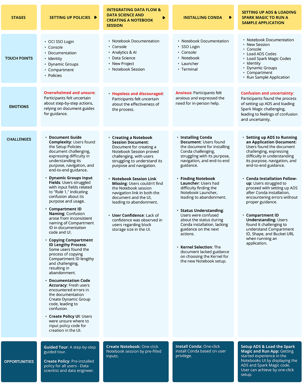
Explore a visual journey through the usability testing process, as I uncover challenges and insights in Datahub.


Research Findings
Overall Observations - Challenges Impacting Usability:
High document complexity affected success rates.
Navigation challenges reduced user satisfaction.
Lack of UI feedback contributed to user uncertainty.
Task Success
What it measures: The percentage of visitors who completed the Notebook tasks.

Setup Policies
0% success due to document complexity and navigation challenges.
Integrate Data Flow & Data Science
0% success; issues with document clarity and finding links.
Create Notebook Session
0% success; document complexity and lack of confidence in session creation.
Install Conda
0% success; challenges in finding the Notebook Launcher and Conda installation status.
Setup ADS & Load Spark Magic
0% success; document challenges and issues after Conda installation.
Run Sample Application
0% success; challenges in understanding Compartment ID, Shape, and Bucket URL.
Overall Trends
Document complexity and navigation challenges impacted success rates.
Time on Task
What it measures: How long it takes to complete the Notebook tasks.

Setup Policies
Average time: 22 minutes; challenges in copying Compartment ID.
Integrate Data Flow & Data Science
Average time: 18 minutes; difficulty in finding links and uncertainty about block storage size.
Create Notebook Session
Average time: 15 minutes; challenges in understanding the process.
Install Conda: Average time
15 minutes; challenges in finding the Notebook Launcher.
Setup ADS & Load Spark Magic
Average time: 15 minutes; document challenges and difficulties after Conda installation.
Run Sample Application
Not completed; challenges in understanding task requirements.
User satisfaction
What it measures: How long it takes to complete the Notebook tasks.


Document Accuracy
29% satisfaction; users found documentation hard to understand.
UI/UX Rating
1.5 out of 5; low satisfaction due to document complexity and navigation issues.
Feedback Themes
Challenges in document understanding, navigation, and lack of UI feedback.
Value Stream Map: Notebook Experience
It helps uncover opportunities for improvement, reduces lead times, minimises waste, and ultimately contributes to a more seamless and productive experience for Data Scientists and Data Engineers.

User Journey Map
The New Design
Idea A
Collaborating with Engineering, product, and business stakeholders, we evolved the existing task experience to achieve 62% efficiency, a significant improvement from the previous 3%.

[from 3% of existing experience efficiency]
Idea B
Fueled by my dissatisfaction with Idea A, I spearheaded a fresh round of brainstorming involving core services
stakeholders of Engineering, product, and business. The question on the table was clear: 'How can we
pre-install every user's task, leading them directly to the Notebook with just one click?' The result, Idea B, exemplifies
our unwavering commitment to delivering an optimal user experience through robust cross-functional collaboration.

[from 62% of Idea A]
One-Click Notebook design approach
In driving the design journey for the one-click new Notebook, I led a strategic effort, collaborating with the Policy Builder Service, Data Science team, Data & AI Service stakeholders, and engineering.

After the Usability Testing
Eight Features Unveiled and Prioritized through RICE framework.
In the design discovery phase, I identified eight features essential for enhancing Datahub's functionality and user experience. Leading a collaborative session with product owners, engineers, and stakeholders, we prioritized these features based on their value and impact.
For MVP2, our strategic focus is on four core tasks: One-Click Notebook, Blue Code Generation, Data Visualization in Graphical View, and Red Code Generation. This prioritization ensures a robust and user-friendly Datahub experience.

Datahub MVP2 Affinity Map
A strategic roadmap, it ensures an optimized Datahub experience for enhanced user satisfaction and productivity.

User Stories
I've crafted user stories tailored for the personas of Data Scientists and Data Engineers, drawing insights from the design discovery phase.

The New Design
Data Scientists and Engineers can effortlessly access the Datahub Ingestion screen by seamlessly navigating from the Data & AI Services section after logging in.

Guided Tour Experience
Inviting users to embark on a guided tour for a swift and intuitive exploration of the seamless Datahub experience.


One-click Experience
Enabling a one-click experience for users to effortlessly create a new Notebook with pre-populated sample code.


Seamless file selection for automatic code generation
Users can effortlessly drag-and-drop files directly from their local machine or choose files from their online storage, enhancing accessibility.


Notebooks
Users can access their Notebooks

My learning
-
Holistic Stakeholder Engagement: Immersing myself in collaborative sessions with the Policy Builder Service team, Data & AI Service business stakeholders, and engineering counterparts provided a rich tapestry of perspectives. Recognizing the diverse stakeholder landscape allowed for a more nuanced and inclusive design approach.
-
Iterative Prototyping: The iterative nature of the prototyping process became a valuable lesson in humility and adaptability. Each iteration, informed by user insights and stakeholder feedback, represented an opportunity to refine and elevate the design, showcasing the significance of humility in the design journey.
-
Technical Exploration: Exploring alternative technological approaches was a lesson in balancing creativity with pragmatism. Recognizing the importance of aligning innovative ideas with technical feasibility instilled a sense of responsibility to deliver solutions that are not just visionary but also practical and implementable.
-
Adaptability: Adapting to the evolving landscape of user tasks and technological possibilities highlighted the dynamic nature of the design process. This learning emphasized the need for a flexible mindset and the ability to pivot swiftly in response to emerging insights and changing requirements.
-
User-Centric Design: Placing user needs at the forefront of the design solution was a constant reminder that, ultimately, technology serves people. This deepened my commitment to creating solutions that not only address pain points but also contribute to a positive and enriching user experience.
-
Drag-and-Drop Efficiency: Introducing drag-and-drop functionality was a lesson in the elegance of simplicity. Streamlining the process of importing files and automating code generation reinforced the principle that simplicity in design often leads to enhanced user satisfaction and efficiency.
-
Automation Code Generation: Implementing code automation became a realization of the power of technology to ease user burdens. Witnessing how automation simplified the code generation process reinforced the idea that technology should empower users, making their tasks more manageable and enjoyable.
-
Instant Data Visualization: Enabling instant data visualization emerged as a catalyst for more interactive and engaging analytics. Seeing users rapidly derive insights through immediate visualization underscored the transformative potential of design in enhancing the analytical journey within the Notebook interface.